Explore the complete Agency NI collection.

Choose from:

LAYOUTS
9 Premium Editorial Images

CAMPAIGNS
Photography + Motion

TRENDING
Current Creative Collections

SIGNATURE PROJECTS
Bespoke Creative Development

ENTERPRISE
Custom AI Solutions

Professionally art directed.
Commercially licensed.
Ready to deploy.

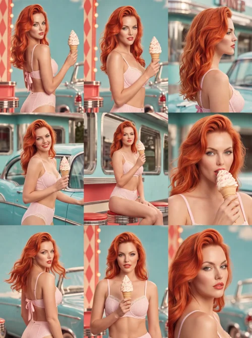
  • Aqua Crush brings the sweetness of a roadside ice-cream stop into a polished portrait of midcentury glamour. Copper-red waves fall against a pale pink striped two-piece, while a strawberry cone adds a playful flourish to the poised glance over her shoulder. Turquoise surroundings, chrome diner details, and the curve of a vintage car create a bright setting where every color feels carefully placed.

    The mood is confident, sunny, and just a little mischievous. Softly luminous skin and sculpted hair balance the nostalgic styling with the clarity of contemporary fashion photography. This layout direction suits summer promotions, confectionery stories, retro hospitality, and lifestyle brands seeking personality alongside elegance. Its pink-and-aqua palette gives the image immediate recognition, with an inviting visual rhythm that carries naturally into a coordinated editorial series.
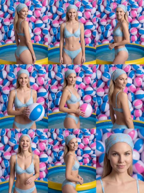
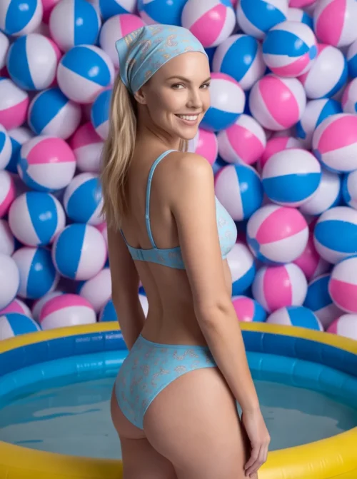
  • Beach Ball Bloom turns a simple poolside portrait into an exuberant study in color and repetition. A wall of blue, pink, and white beach balls creates a recognizable backdrop, echoed by the pale blue patterned swimsuit and matching headscarf. The blue paddling pool and bright yellow rim add another playful layer, while her smile keeps the composition warm and personal.

    Glossy inflatable surfaces contrast with soft fabric and natural skin, giving the scene a tactile, studio-made quality. The abundance of rounded shapes creates visual rhythm without losing the portrait's central focus. This layout direction suits summer leisure, pool accessories, swimwear, and cheerful lifestyle promotions. Its bold backdrop offers a distinctive brand atmosphere, combining retro charm with contemporary color and a sense of holiday fun that feels both inviting and memorable.

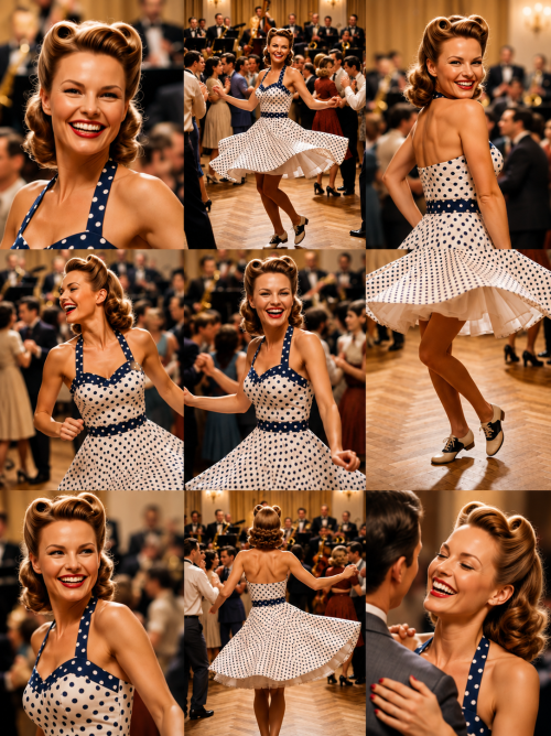
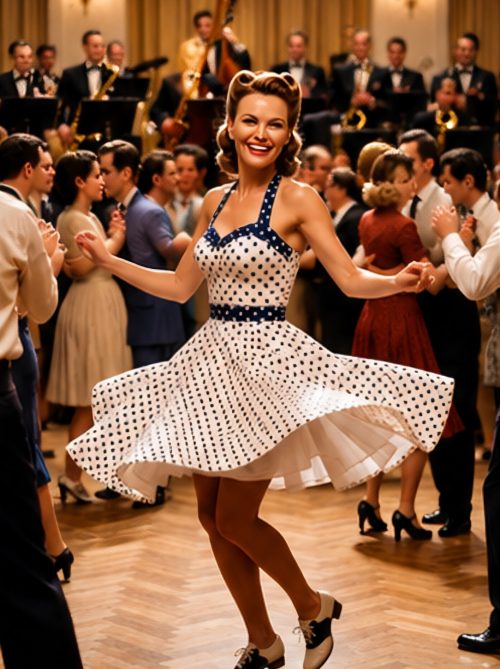
  • Step into the elegance of the Swing Era with Dance 1940, a premium nine-panel editorial collection celebrating the glamour, romance, and timeless energy of America’s golden age of ballroom dancing.
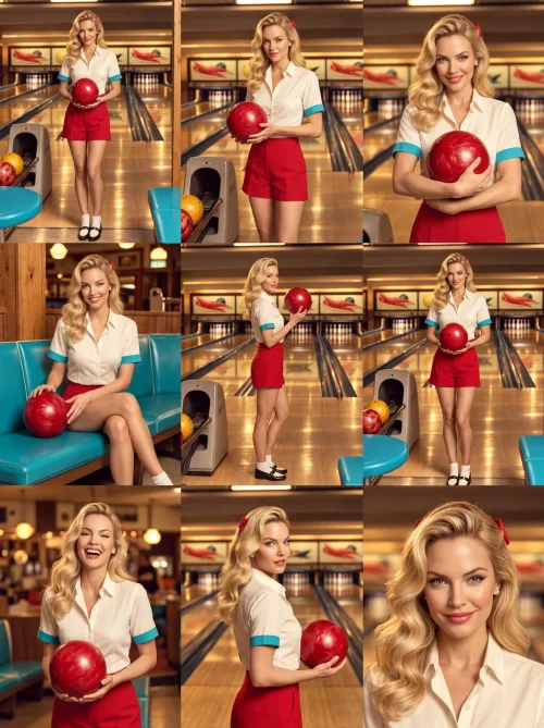
  • Lucky Strike brings classic bowling-alley character into a polished fashion story. A cream blouse with turquoise cuffs, tailored red shorts, white ankle socks, and saddle shoes create a clean midcentury silhouette. The glossy red bowling ball provides a strong central accent, while warm wooden lanes, colorful balls, and turquoise seating make the setting feel rich with Americana.

    Blonde waves and a composed expression give the portrait confidence that sits comfortably within its playful surroundings. Reflections along the lanes draw the eye through the image, balancing the graphic wardrobe colors with golden interior light. This layout direction works well for leisure brands, vintage fashion, entertainment venues, and lifestyle campaigns. Its appeal lies in the combination of everyday recreation and editorial polish: spirited, approachable, and grounded in the charm of the fifties.

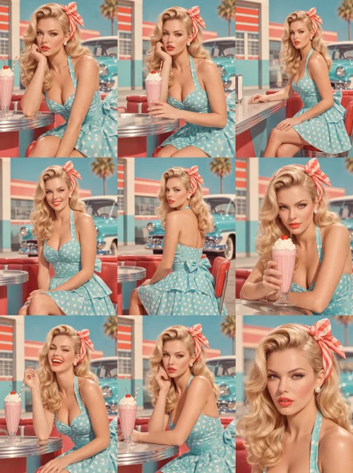
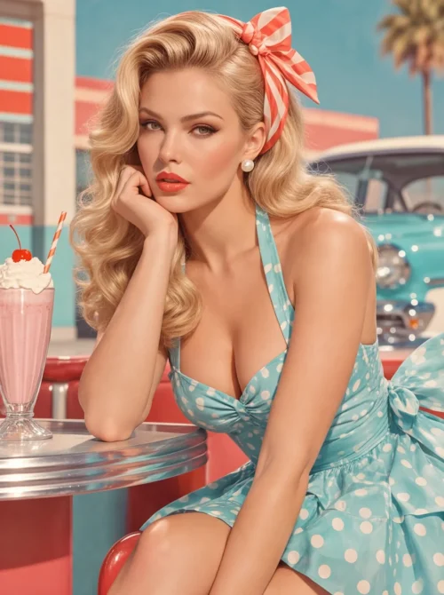
  • Milkshake Muse turns a chrome diner counter into a stage for effortless blonde glamour. Sculpted waves, a coral gingham bow, and an aqua polka-dot halter dress create a richly coordinated portrait, while a pink milkshake brings a familiar touch of sweetness. A vintage turquoise car and sunlit pastel architecture extend the scene beyond the counter, giving it the atmosphere of an American summer afternoon.

    Her thoughtful pose and direct gaze balance the playful surroundings with editorial confidence. Reflective metal, soft fabric, and luminous skin give the composition depth, while coral and aqua accents keep the story bright and inviting. This layout direction is well suited to retro dining, dessert promotions, summer fashion, and hospitality brands. It offers nostalgia with polish, personality, and a clear visual language that feels immediately welcoming.

  • Mint Condition pairs a vanilla swirl with the unmistakable charm of a vintage fashion portrait. Sculpted copper-red waves frame a composed expression, while a mint halter dress scattered with white polka dots brings movement and freshness to the image. The flared skirt, pearl bracelets, and softly mottled green backdrop create a scene that feels playful without losing its elegant sense of control.

    Creamy highlights and gentle shadows give the fabrics and skin a tactile richness. The ice-cream cone becomes a small character in the composition, connecting the polished styling to a familiar summer pleasure. Designed around sweetness, poise, and a clean pastel palette, this layout direction works beautifully for dessert brands, seasonal retail, vintage-inspired fashion, and cheerful lifestyle storytelling. The overall impression is indulgent, approachable, and confidently nostalgic.

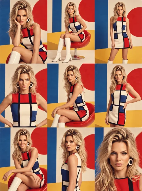
  • Mod Authority makes a bold statement through graphic tailoring and a deliberately composed pose. A red, cream, blue, and black mini dress meets white boots and oversized circular earrings, while broad geometric shapes continue across the studio backdrop. Blonde waves introduce softness to the angular design, and a direct, unwavering gaze gives the portrait its confident editorial presence.

    The seated composition feels relaxed, yet every line contributes to the image's visual structure. Bright color blocks, clean surfaces, and controlled lighting recall the energy of sixties fashion photography without sacrificing contemporary detail. This layout direction suits statement apparel, footwear, accessories, and beauty brands seeking a strong retro identity. It is expressive, graphic, and self-assured, with a palette and silhouette that can carry a distinctive fashion story across an entire coordinated series.

  • Oh, Darling captures the playful surprise of a classic magazine beauty portrait. Sculpted blonde waves, a navy bow dotted with white, and vivid red lips create a face framed by unmistakable fifties styling. The colorful plaid shirt adds a casual note, while the delicate hand gesture and direct blue-eyed gaze give the close composition its engaging character.

    A quiet gray backdrop leaves every detail room to register: glossy nails, satin ribbon, clean eyeliner, and the texture of softly lit skin. The result feels bright and personable, with enough photographic polish for a confident beauty or fashion story. This layout direction suits cosmetics, hair accessories, vintage-inspired apparel, and portrait-led brand campaigns. Its strength is expression, offering a memorable mix of charm, color, and poised editorial presence without needing an elaborate setting.

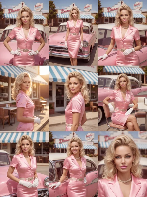
  • Pink Cadillac presents roadside Americana through the lens of polished Hollywood fashion. A glossy pink satin outfit, white gloves, a jeweled belt, and a sparkling necklace give the blonde portrait a dressed-up confidence. Behind her, a pink vintage car and striped diner awning complete a scene where everyday travel becomes an occasion for unmistakable glamour.

    Sculpted waves and a poised stance anchor the composition, while soft daylight reveals the satin's shine and the car's smooth curves. The coordinated pink palette feels exuberant, balanced by pale accessories and the familiar architecture of a classic diner. This layout direction is ideal for vintage-inspired fashion, accessories, automotive lifestyle, and destination hospitality. It combines personality and polish with a cinematic sense of arrival, offering a colorful editorial identity that feels proudly nostalgic and recognizable.

  • Primary Instinct brings the graphic confidence of the Mod era into a striking beauty portrait. Bold red, blue, cream, and black shapes echo between the sleeveless dress and the geometric backdrop, creating a composition with immediate visual impact. Blonde hair softens the strong lines, while circular earrings and a steady gaze give the image its precise, self-possessed character.

    This is retro fashion expressed through shape and color rather than decorative nostalgia. Clear lighting, defined eyes, and closely framed detail let the face remain the focal point within an energetic graphic setting. The layout direction suits fashion launches, beauty campaigns, accessories, and brands looking for an assertive studio identity. Its disciplined palette and architectural styling support a coordinated series with strong recognition, confident attitude, and a distinctly modern sense of rhythm.

  • Soft Serve builds its character through restraint: pale pink styling, a cool mint backdrop, and a single vanilla cone. Loose copper-red waves bring warmth to the composition, while the glance over one shoulder gives the portrait a poised, self-assured presence. Fine stripes, delicate trim, and softly lit fabric add detail without competing with the face or the clean studio setting.

    The result is a pastel fashion story with a confectionery accent. Its muted surroundings make the red hair and creamy ice-cream swirl expressive, creating a visual identity that feels both nostalgic and contemporary. This layout direction lends itself to summer retail, beauty editorials, ice-cream promotions, and vintage-inspired lifestyle imagery. The tone remains calm and polished, with just enough personality to turn a simple studio portrait into a memorable brand moment.

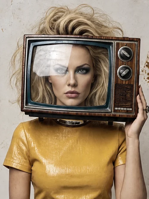
  • Stay Tuned transforms a vintage television into a playful fashion illusion. A mustard-yellow outfit echoes the warmth of the woodgrain CRT, while the subject's face appears within the screen and blonde hair rises above it. An aged cream wall keeps the setting spare, letting the unexpected relationship between person and object become the center of the image.

    Across nine photographs, varied poses and camera distances develop the same inventive concept into a complete editorial story. This direction suits creative branding, music and media imagery, retro campaigns, and fashion that welcomes a little wit. The warm palette and instantly recognizable television motif give the series a memorable identity, balancing photographic realism with a confident surreal twist.

Go to Top